import napari
import numpy as np
import seaborn as sns
from napari.utils.notebook_display import nbscreenshot
from IPython.display import Image
Multichannel IMC data#
Working with Imaging Mass Cytometry (IMC) data#
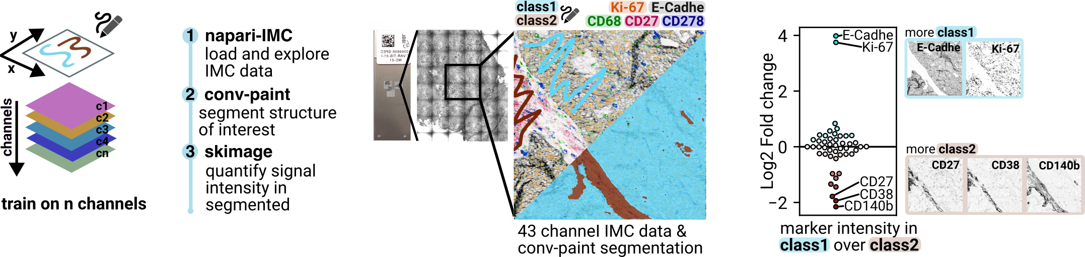
Here we demonstrate how Convpaint can easily work on multichannel data. As an example we use a publicly available IMC dataset Eling et. al (2022) with more than 40 channels.
In this tutorial, we will:
Load and explore IMC data into napari using the napari-IMC plugin.
Annotate a structure of interest.
Train Convpaint on all channels of the dataset, to find regions in the sample that are similar to the annotated structure.
Load the segmentation from Convpaint into the jupyter notebook.
Extract some simple statistics using skimage and numpy.
Plot the results.
Let’s open napari and add the napari-imc plugin.
viewer = napari.Viewer()
_,_ = viewer.window.add_plugin_dock_widget('napari-imc') #open the napari-imc plugin
/Users/luhin/miniforge3/envs/napari-env/lib/python3.9/site-packages/napari_tools_menu/__init__.py:165: FutureWarning: Public access to Window.qt_viewer is deprecated and will be removed in
v0.5.0. It is considered an "implementation detail" of the napari
application, not part of the napari viewer model. If your use case
requires access to qt_viewer, please open an issue to discuss.
self.tools_menu = ToolsMenu(self, self.qt_viewer.viewer)
Drag and drop the IMC data, e.g. Patient1.mcd downloaded from zenodo. You will see an overview of the whole slide.
nbscreenshot(viewer)

Check
Panorama_002to load a higher magnification FOV.Check
pos1_1to access the IMC data of one FOV.
nbscreenshot(viewer)

Now you can load the different channels for
pos1_1. Check the boxes and the channel will be added as a new image layer.Delete both overview layers (
Patient1.mcd [P02]andPatient1.mcd [P02]).Next we simplify the layer names (e.g.
Patient1.mcd [A01 Histone_126((2979))In113]becomesHistone).
#get all the napari layer names
def get_layer_names(viewer):
layer_names = []
for i,layer in enumerate(viewer.layers):
#extract everythin in [] and add to list
if '[' in layer.name:
name = layer.name.split('[')[1].split(']')[0][4:]
#if there are () in the name, extract everything before the first (
if '(' in name:
name = name.split('(')[0]
#if there are _ in the name, extract everything before the first _
if '_' in name:
name = name.split('_')[0]
layer_names.append(name)
return layer_names
def set_layer_names(viewer,layer_names):
for i,layer in enumerate(viewer.layers):
layer.name = layer_names[i]
layer_names = get_layer_names(viewer)
set_layer_names(viewer,layer_names)
layer_names[25:40] #show a subset of the layer names
['CD45RA',
'CD45RO',
'CD4',
'CD68',
'CD7',
'CD8a',
'Carboni',
'DNA1',
'DNA2',
'E-Cadhe',
'FOXP3',
'Granzym',
'HLA-DR',
'Histone',
'Indolea']
Next let’s have a look at some of the channels, playing around with different colormaps and blending modes.
Below is the code to reproduce the colors we’ve chosen to create the figure at the beginning of the document:
for i,layer in enumerate(viewer.layers):
layer.visible = False
layer.colormap= 'gray_r'
layer.blending= 'minimum'
viewer.layers['Ki-67'].visible = True
viewer.layers['Ki-67'].colormap = 'I Orange'
viewer.layers['Ki-67'].contrast_limits = (0, 300)
viewer.layers['E-Cadhe'].visible = True
viewer.layers['E-Cadhe'].colormap = 'gray_r'
viewer.layers['E-Cadhe'].contrast_limits = (0, 200)
viewer.layers['CD68'].visible = True
viewer.layers['CD68'].colormap = 'I Forest'
viewer.layers['CD68'].contrast_limits = (0, 70)
viewer.layers['CD27'].visible = True
viewer.layers['CD27'].colormap = 'I Bordeaux'
viewer.layers['CD27'].contrast_limits = (0, 20)
viewer.layers['CD278'].visible = True
viewer.layers['CD278'].colormap = 'I Blue'
viewer.layers['CD278'].contrast_limits = (0, 20)
nbscreenshot(viewer)

Next we open Convpaint to label and segment a structure of interest.
To train Convpaint on a multichannel image, duplicate all the layers and merge them into a stack. Rename this new layer
stack. The stack shoud have dimensions[channels, x, y].
# to load the labels from disk:
# viewer.add_labels(np.load('../sample_data/imc_tutorial/annotations.npy'), name='annotations')
print(f"Dimensions of stack layer: {viewer.layers['stack'].data.shape}")
Dimensions of stack layer: (47, 600, 600)
Make sure that you have selected:
Layer to segment: stack
Data dimensions: Multichannel image
nbscreenshot(viewer)
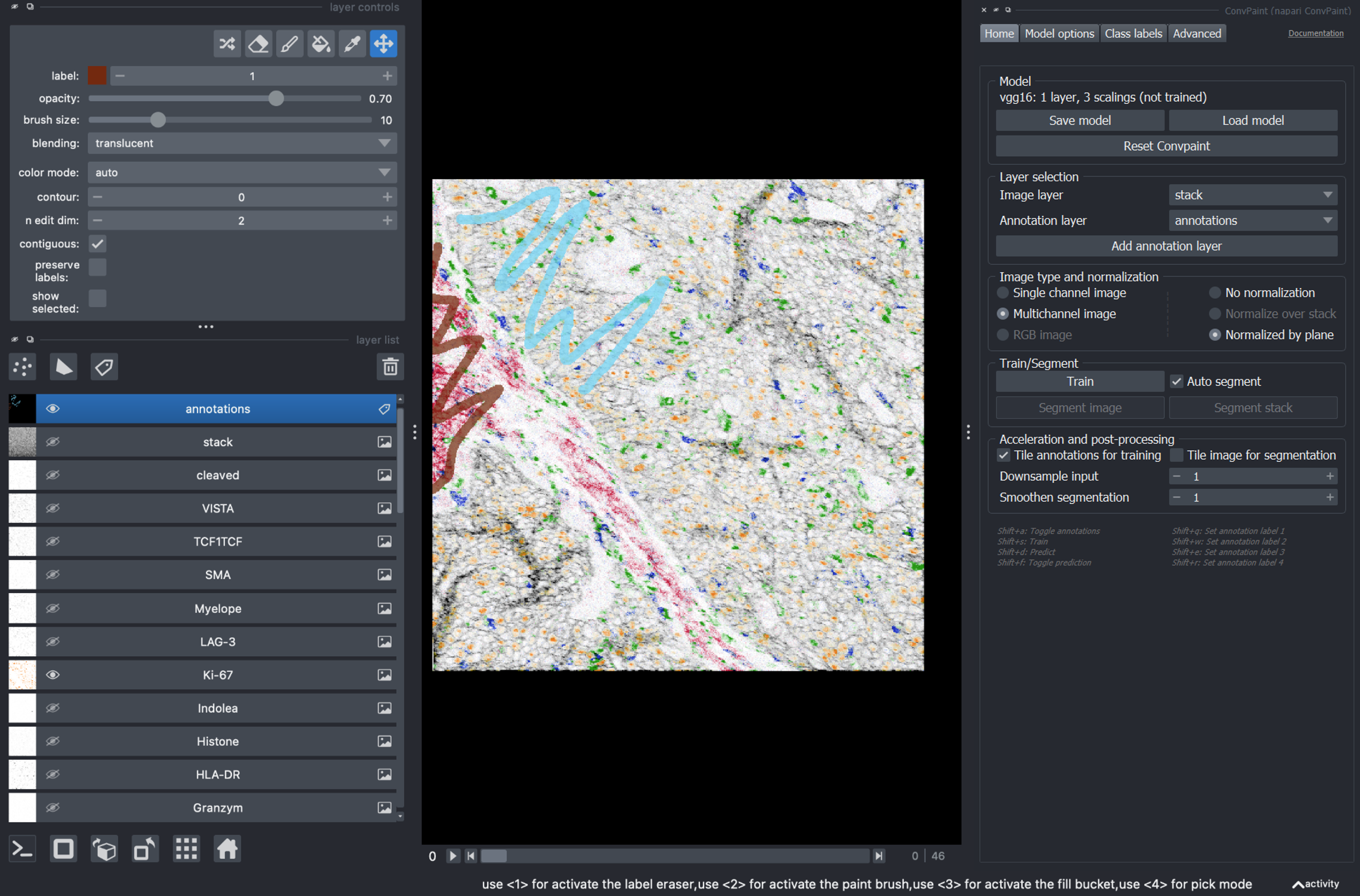
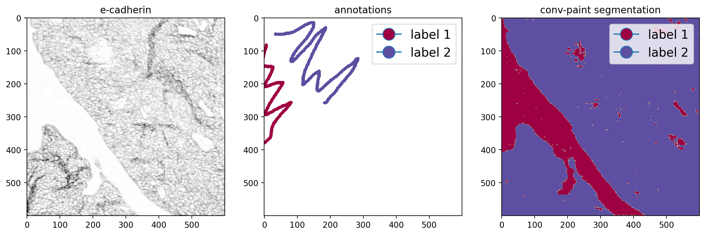
Click on Train, then on Segment image and you will see the segmentation results. Below, we plot a sample channel (E-cadherin), the annotations and the segmentation.
import matplotlib.pyplot as plt
#prepare the data for plotting
annot = viewer.layers['annotations'].data[:,:].copy().astype(float)
annot[annot==0] = np.nan
#function to get the color of a class for a given colormap
def get_color(x, cmap, vmin, vmax):
norm = plt.Normalize(vmin, vmax)
return cmap(norm(x))
#create the figure
fig, axes = plt.subplots(1, 3, figsize=(15, 5),dpi=200)
axes[0].imshow(viewer.layers['E-Cadhe'].data[:,:], cmap='gray_r', vmin=0, vmax=200)
axes[0].set_title('e-cadherin')
axes[1].imshow(annot, cmap='Spectral')
axes[1].set_title('annotations')
axes[2].imshow(viewer.layers['segmentation'].data[:,:], cmap='Spectral')
axes[2].set_title('Convpaint segmentation')
#add a legend to the annotations and prediction image
label_1_col = get_color(1, plt.cm.Spectral, 1, 2)
label_2_col = get_color(2, plt.cm.Spectral, 1, 2)
legend = ['label 1','label 2']
axes[1].legend(handles=[plt.Line2D([0], [0], marker='o', markerfacecolor=label_1_col, markersize=15),
plt.Line2D([0], [0], marker='o', markerfacecolor=label_2_col, markersize=15)],
labels=legend, loc='upper right', fontsize=15)
axes[2].legend(handles=[plt.Line2D([0], [0], marker='o', markerfacecolor=label_1_col, markersize=15),
plt.Line2D([0], [0], marker='o', markerfacecolor=label_2_col, markersize=15)],
labels=legend, loc='upper right', fontsize=15)
plt.show()
Now let’s calculate some statistics from the segmented regions!
We will use skimage for this, specifically the
regionpropsfunction. The results are then stored in a pandas dataframe.We can load the segmentation by accessing the
segmentationlayer from the viewer object.The resulting dataframe will have a row for all channels and two columns measuring the mean intensity of a given channel for both segmented regions.
import pandas as pd
from skimage.measure import regionprops_table
segmentation = viewer.layers['segmentation'].data
data = viewer.layers['stack'].data
data = np.moveaxis(data,0,-1) #move the channel axis to the end
#measure mean intensity for all channels and labels.
props = regionprops_table(segmentation, data, properties=['label','mean_intensity'])
df = pd.DataFrame(props) #convert to pandas dataframe
df = df.iloc[:,1:] #remove the first column
df.columns = layer_names #set the column names to the layer names
df = df.T #transpose the df (channels as rows, classes as columns)
df.columns = ['mean_label_1','mean_label_2']
df[25:40]
| mean_label_1 | mean_label_2 | |
|---|---|---|
| CD45RA | 1.760827 | 0.905443 |
| CD45RO | 5.836210 | 4.595664 |
| CD4 | 3.892849 | 3.885281 |
| CD68 | 5.278469 | 4.437712 |
| CD7 | 3.556351 | 3.925540 |
| CD8a | 1.631149 | 1.329093 |
| Carboni | 1.264888 | 1.509467 |
| DNA1 | 31.957056 | 26.604399 |
| DNA2 | 56.711292 | 47.111633 |
| E-Cadhe | 1.840578 | 29.409462 |
| FOXP3 | 1.435743 | 1.265342 |
| Granzym | 1.761777 | 2.140133 |
| HLA-DR | 6.855837 | 10.146724 |
| Histone | 2.353358 | 3.118237 |
| Indolea | 1.677298 | 2.252678 |
Calculate the log2 fold change between the two classes with numpy
df['log_fold_change'] = np.log2((df['mean_label_2']/df['mean_label_1']).values)
df[25:40]
| mean_label_1 | mean_label_2 | log_fold_change | |
|---|---|---|---|
| CD45RA | 1.760827 | 0.905443 | -0.959558 |
| CD45RO | 5.836210 | 4.595664 | -0.344759 |
| CD4 | 3.892849 | 3.885281 | -0.002807 |
| CD68 | 5.278469 | 4.437712 | -0.250303 |
| CD7 | 3.556351 | 3.925540 | 0.142494 |
| CD8a | 1.631149 | 1.329093 | -0.295446 |
| Carboni | 1.264888 | 1.509467 | 0.255029 |
| DNA1 | 31.957056 | 26.604399 | -0.264470 |
| DNA2 | 56.711292 | 47.111633 | -0.267553 |
| E-Cadhe | 1.840578 | 29.409462 | 3.998050 |
| FOXP3 | 1.435743 | 1.265342 | -0.182271 |
| Granzym | 1.761777 | 2.140133 | 0.280670 |
| HLA-DR | 6.855837 | 10.146724 | 0.565609 |
| Histone | 2.353358 | 3.118237 | 0.406010 |
| Indolea | 1.677298 | 2.252678 | 0.425503 |
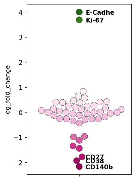
Sort the dataframe by the fold-change and, plot with seaborn. Let’s also label some of the most extreme values (top two and bottom three).
import matplotlib.cm as cm
df = df.sort_values(by='log_fold_change', ascending=False)
cmap = cm.get_cmap('PiYG')
norm = plt.Normalize(-2, 2)
plt.figure(figsize=(3,5),dpi=150)
sns.swarmplot(y='log_fold_change', data=df, size=10, palette='PiYG',
hue='log_fold_change', dodge=False,edgecolor='black', linewidth=0.3)
#disable the legend
plt.legend([],[], frameon=False)
#label the most extreme values
for i in [0,1,-3,-2,-1]:
print(f"Layer: {df.index[i]} \t log fold change: {df.iloc[i,-1]:.2f}")
plt.text(0.06, df.iloc[i,-1]-.1, df.index[i], horizontalalignment='left', size='medium', color='black', weight='semibold')
Layer: E-Cadhe log fold change: 4.00
Layer: Ki-67 log fold change: 3.69
Layer: CD27 log fold change: -1.77
Layer: CD38 log fold change: -1.93
Layer: CD140b log fold change: -2.17
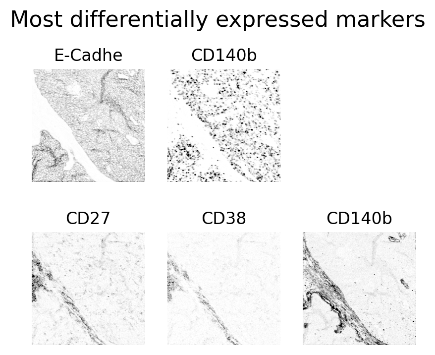
Let’s have a look at the actual image data of these 5 channels!
#make subplots for the two most extreme markers
fig, axes = plt.subplots(2, 3, figsize=(5, 4),dpi=200)
axes = axes.flatten()
axes[0].imshow(viewer.layers[df.index[0]].data, cmap='gray_r', vmin=0, vmax=200)
axes[0].set_title(df.index[0])
axes[1].imshow(viewer.layers[df.index[1]].data, cmap='gray_r', vmin=0, vmax=200)
axes[1].set_title(df.index[-1])
#add title to the figure
axes[3].imshow(viewer.layers[df.index[-3]].data, cmap='gray_r', vmin=0, vmax=20)
axes[3].set_title(df.index[-3])
axes[4].imshow(viewer.layers[df.index[-2]].data, cmap='gray_r', vmin=0, vmax=20)
axes[4].set_title(df.index[-2])
axes[5].imshow(viewer.layers[df.index[-1]].data, cmap='gray_r', vmin=0, vmax=20)
axes[5].set_title(df.index[-1])
# disable the axis
for ax in axes:
ax.axis('off')
#add title to the figure
plt.suptitle('Most differentially expressed markers', fontsize=16, y=1.0)
plt.show()