Post-processing#
This notebook demonstrates how to produce plots to represent the information extracted from the morphodynamics behavior. All plots are returned as Matplotlib figures that can be customized and exported easily.
#%load_ext autoreload
#%autoreload 2

import matplotlib
%matplotlib widget

import numpy as np
import matplotlib.pyplot as plt
import ipywidgets as ipw
from IPython.display import display

import morphodynamics.plots
from morphodynamics.plots.ui_wimage import Wimage
from morphodynamics.plots import animate_plots, show_plots
from morphodynamics.utils import load_alldata
/Users/gw18g940/miniconda3/envs/morphodynamics/lib/python3.9/site-packages/dask_jobqueue/core.py:20: FutureWarning: tmpfile is deprecated and will be removed in a future release. Please use dask.utils.tmpfile instead.
  from distributed.utils import tmpfile
Define a path to a folder containin the Parameters, Results etc. and use the utils.load_alldata to import the data:
default_path = '../synthetic/data/Results_step/'
param, res, data = load_alldata(default_path, load_results=True)
Display the windows#
wimage = Wimage(param, data, res)
wimage.interface
Curvature, length etc.#
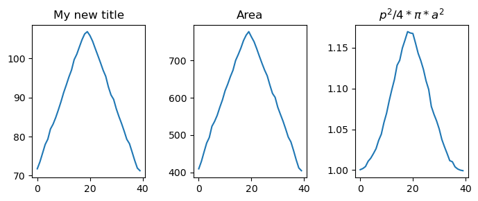
Create a plot containing geometrical properties of the contour over time:
fig_curv, ax_curv = show_plots.show_geometry_props(data, res, size=(7,3), titles=['Length [um]', 'Area', '$p^2/4*\pi*a^2$'])
As the previous function returned the corresponding figure and axis, we can adjust now our plt. For example we can override the title of the first figure:
ax_curv[0].set_title('My new title')
fig_curv

We can also plot single properties:
fig, ax = show_plots.show_geometry(data, res, prop='circularity', size=(4,2))
Edge overview#
fig_edge_overview, ax_edge_overview = show_plots.show_edge_overview(
    param, data, res, lw=0.6, size=(7, 5), cmap_image='Blues',
    cmap_contour='jet', show_colorbar=False)
As an example, to save a figure, you can just use the standard Matplotlib commands:
fig_edge_overview.savefig('edge_overview.pdf')
Edge vectorial#
For the edge plots, we can either create a static plot or an animation. To create the animation, we first create a figure and then re-use it. This means that any customization made on the static figure (as here the xlabel) are conserved in the animation:
out = ipw.Output()
with plt.ioff():
    fig, ax = plt.subplots(figsize=(5,5))
    fig_edge_vect, ax_edge_vect = show_plots.show_edge_vectorial_aux(
        param, data, res, k=1, curvature=False, fig_ax=(fig, ax))
    ax.set_xlabel('my test');

int_box = animate_plots.interact_edge_vect(data, param, res, fig, ax)
ipw.VBox([fig.canvas, int_box])
Edge rasterized#
The same is true for the visualization of the rasteried contour plot:
from morphodynamics.splineutils import edge_colored_by_features
with plt.ioff():
    fig, ax = show_plots.show_edge_raster_coloured_by_feature(
        data, res, 10, feature='curvature', N=None, width=3, normalize=True, cmap_name='jet')

t_slider = animate_plots.interact_edge_raster_coloured_by_feature(data, param, res, 100, feature='displacement_cumul',
                                                        fig=fig, ax=ax, width=3,normalize=True, cmap_name='jet', alpha=0.8)
ipw.VBox([fig.canvas, t_slider])
The colouring of the edge can represent several varaibles: displacement, cumulative displacement or curvature. These options can be set via the feature option:
im_disp,_ = edge_colored_by_features(data, res, t=0, feature='displacement', N=100)
im_disp_cumul,_ = edge_colored_by_features(data, res, t=0, feature='displacement_cumul', N=100)
im_curv,_ = edge_colored_by_features(data, res, t=20, feature='curvature', N=100)
plt.figure()
plt.imshow(im_curv);
fig, ax = show_plots.show_edge_raster_coloured_by_feature(data, res,20, 'displacement_cumul', width=4, cmap_name='jet'
                                               )
Curvature#
fig, ax = show_plots.show_curvature(data, res, cmap_name='jet', show_colorbar=False)
Displacement#
fig, ax = show_plots.show_displacement(res, size=(4, 3), cmap_name='jet');
fig, ax = show_plots.show_cumdisplacement(res, size=(4, 3), show_colorbar=False);
Signals#
Signal list:
for ind,s in enumerate(data.signal_name):
    print(f'index {ind}: {s}')
index 0: synth_ch2.h5
index 1: synth_ch3.h5
fig, ax = show_plots.show_signals_aux(
    data, res, signal_index=0, layer_index=0, mode='Mean', fig_ax=None, size=(5, 3),
    title='Signal', xlabel='Frame', cmap_name='jet', show_colorbar=True
)
Here again one can easily customize the plot.
ax.set_title("Signal: Channel 1")
Text(0.5, 1.0, 'Signal: Channel 1')
