Data analysis#
After segmentation, windowing and signal extraction, we can finally perform some data analysis. We show here how to create various types of plots using the show_plots submodule.
%load_ext autoreload
%autoreload 2
from morphodynamics.plots import show_plots
In order to be able to display data, we first need to import them. For that we can again use our data loading function and point to an analysis folder:
from morphodynamics.utils import load_alldata
param, res, data = load_alldata('../../../Projects_data/napari-morphodynamics/exp051/', load_results=True)
Geometric properties#
First we plot some geometric information:
import matplotlib.pyplot as plt

fig, ax = plt.subplots(1,3, figsize=(10,3))

show_plots.show_geometry(data=data, res=res, prop='length', fig_ax=(fig, ax[0]))
show_plots.show_geometry(data=data, res=res, prop='area', fig_ax=(fig, ax[1]))
show_plots.show_geometry(data=data, res=res, prop='circularity', fig_ax=(fig, ax[2]));

We can also display all contours with a time-color coding:
ax_edge = show_plots.show_edge_overview(param, data, res, size=(6,6));
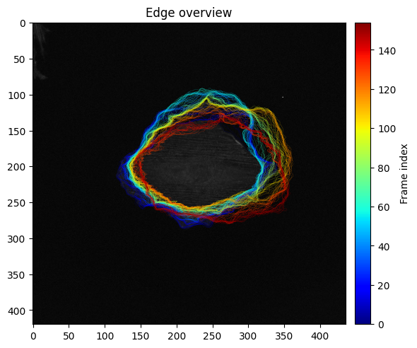
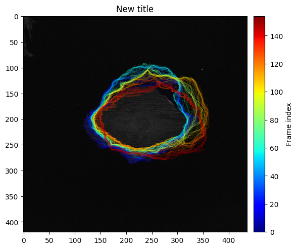
Note that this functions generally return a Matplotlib ax object which can be used to further edit a figure.
ax_edge.set_title('New title')
ax_edge.figure
Windows#
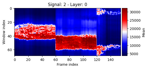
We can also display the signal in the windows over time. Here we have to pick which channel to use as well as which layer of windows.
show_plots.show_signals_aux(data, res, signal_index=2, layer_index=0, percentile=1, size=(6,3));
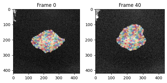
Additionally we can visualize the windows on top of the image itself:
fig, ax = plt.subplots(1,2, figsize=(6,3))
show_plots.show_windows(data, param, frame=0, signal_index=0, size=(5,5), fig_ax=(fig, ax[0]))
show_plots.show_windows(data, param, frame=40, signal_index=0, size=(5,5), fig_ax=(fig, ax[1]));
Correlations#
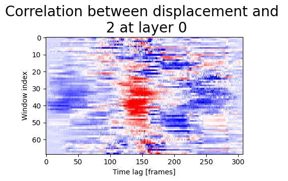
Finally we can display correlations between signal and displacement:
signal_name1='0'
signal_name2='1'
window_layer=0
show_plots.show_correlation_core(res, param, 'displacement', '2',0, 'Pearson', size=(5,3));
