19. Other libraries#
There are many alternatives to the solutions shown during the course. Depending on your field and background you might want to search for another solution. Generally however libraries work mostly like seaborn i.e. you pass a data element to a plotting function and then specify which “aspect” of the data you want to plot and use for color, marker etc. aesthetics.
import pandas as pd
import numpy as np

diams = pd.read_csv('https://raw.githubusercontent.com/vincentarelbundock/Rdatasets/master/csv/Ecdat/Diamond.csv', index_col=0)
Plotnine#
Plotnine is one alternative to seaborn. It is in fact an almost perfect copy of ggplot, so if you are familiar with that R package but want to “unify” your pipeline in Python, it could be a good alternative.
The functions have mostly the same name as in ggplot, and the assembling of plots works in the same way. Two examples here:
from plotnine import ggplot, geom_point, aes, stat_smooth, facet_wrap, geom_boxplot
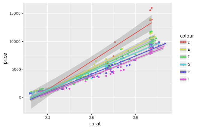
fig = (ggplot(diams, aes('carat', 'price', color='colour'))
 + geom_point()
 + stat_smooth(method='lm')
);
fig
<ggplot: (332292430)>
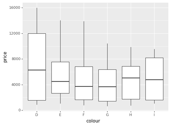
fig = (
    ggplot(diams)
    + geom_boxplot(aes(x='colour', y='price'))
)
fig
<ggplot: (279074874)>
Altair#
Altair is another library that works similarly to seaborn. It is based on an entirely different ecosystem (non Matplotlib) but offeres interesting possibilities in terms of interactivity.
Here an example as well:
import altair as alt

alt.Chart(diams).mark_point().encode(
    x='price',
    y='carat',
    color='colour',
).interactive()
Plotly#
Plotly is also a very popular library. It is in particular widely used to create interactive dashboards running on a server. The principles are again the same as for seaborn plotting:
import plotly.express as px

fig = px.scatter(diams, x="carat", y="price", color="colour")
fig.show()