5. Minimal plotting#
We will see in the last part of the course how to do different types of plotting, how to adjust all elements in a plot etc. However before we reach this point, we need a simple way to have a look at simple datasets to better understand them. In this notebook, we therefore give a very minimalistic introduction to plotting which allows you to create line or scatter plots as well as histograms. For this we introduce here the Matplotlib library, which is the oldest and still one of the most widely used plotting library.
We start by importing it. Almost all the most important functions are located in a submodule called pyplot which is almost systemaically abbreviated into plt:
import matplotlib.pyplot as plt
import numpy as np
Dataset#
We start by creating a simple dataset. As an exercise we do this by using Numpy functions. First we generate an x-axis:
x_val = np.arange(0, 10, 0.1)
Then we create a new array that is just the cosine of x_val:
y_val = np.cos(x_val)
Line plot#
Those two arrays are all we need to create the simplest possible plot of a function y_val = cos(x_val). The first thing that we have to do is to create a figure object and an axis object with Matplotlib. The figure object can contain many elements (imagine for example a grid of plots), while the axis object contains a specific plot. We can get a figure and and an axis using the subplots() function:
fig, ax = plt.subplots()
As you see above this produces a blank figure that we need to fill. As all the variables that we have seen until now (Numpy arrays, Pandas dataframe) the fig and ax objects have specific functions attached to them. ax in particular has all the plotting functions attached to it. In particular the simple plot() function, which takes two arguments: x values and y values:
fig, ax = plt.subplots()
ax.plot(x_val, y_val);
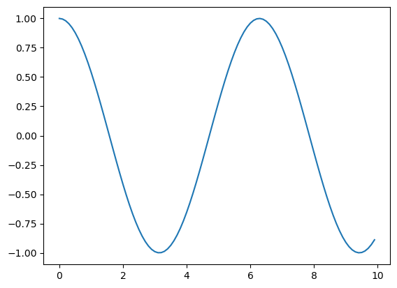
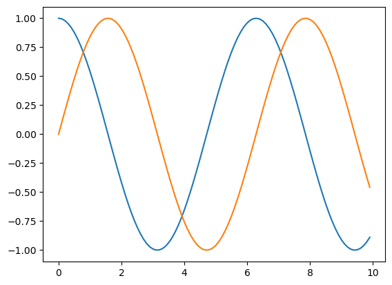
That’s it, we have our plot! We can easily add more data to it by just calling more times the ax.plot function. For example we can generate a new y signal for the sine:
y_val2 = np.sin(x_val)
fig, ax = plt.subplots()
ax.plot(x_val, y_val);
ax.plot(x_val, y_val2);
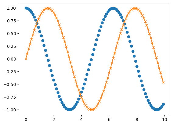
We will see later how to adjust everything on this plot from colors to labels etc. The only additional point we show here is how to show every datapoint with a marker such as a circle using an additional parameter representing the line/marker type:
fig, ax = plt.subplots()
ax.plot(x_val, y_val,'o');
ax.plot(x_val, y_val2,'-x');
Histogram#
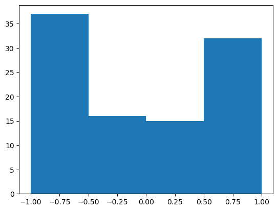
The other type of plot that is very useful, in particular when dealing with statistics, is the histogram. The principle of figure creation is the same. Except that now we use the ax.hist() commmand which takes only one argument, the values that we want to turn into a histogram:
fig, ax = plt.subplots()
ax.hist(y_val);
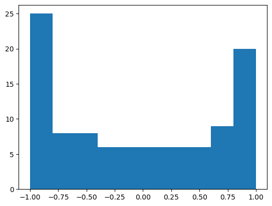
Again, we will see how to specify more options for this plot. At the moment we only show that we can specify the position of the bins that we want to use for binning. This can be useful if the default bin size is not satisfactory. We can simply use the bins arguments and pass an array of positions:
fig, ax = plt.subplots()
ax.hist(y_val, bins=np.arange(-1,1.5,0.5));
Exercise#
Using Pandas, import the CSV file located at https://raw.githubusercontent.com/allisonhorst/palmerpenguins/master/inst/extdata/penguins.csv
Display the first 3 lines using the
head()function.Rembering that you can extract a given column from the table using
my_dataframe['column_name'], try to plot thebill_depth_mmas as function ofbill_length_mmusing theplotfunction. Does it work ? Did you pass a Numpy array to the plotting function ?Change the line/marker type so that you obtain a scatter plot, i.e. only single dots without a line