16. Regression#
Seaborn is a great tool if you want to quickly explore data and relations between variables. In addition to just plotting scatterplots you can also perform regression while plotting, a task for which seaborn uses the statsmodels package. Note that you cannot extract fit values from the plots. The goal here is rather exploratory or to generate figures. If you need the fit values you will need to use statsmodels directly.
import pandas as pd
import numpy as np
import matplotlib.pyplot as plt
import seaborn as sns

diams = pd.read_csv('https://raw.githubusercontent.com/vincentarelbundock/Rdatasets/master/csv/Ecdat/Diamond.csv', index_col=0)
diams.head(5)
| carat | colour | clarity | certification | price | |
|---|---|---|---|---|---|
| 1 | 0.30 | D | VS2 | GIA | 1302 |
| 2 | 0.30 | E | VS1 | GIA | 1510 |
| 3 | 0.30 | G | VVS1 | GIA | 1510 |
| 4 | 0.30 | G | VS1 | GIA | 1260 |
| 5 | 0.31 | D | VS1 | GIA | 1641 |
lmplot and regplot#
The two functions are very similar in that they allow you to compute a fit and plot it. The main difference is the input. lmplot requires a DataFrame as data input while regplot is more flexible. In the frame of this course we focus on lmplot.
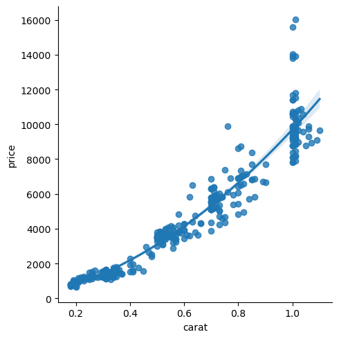
The idea is that you pass a DataFrame to the function and specify y and x variables to fit as y~x. By default the fit is linear:
sns.lmplot(data=diams, x='carat', y='price');
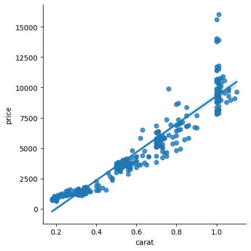
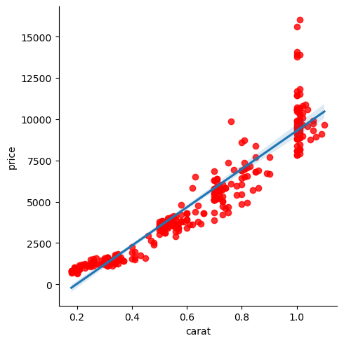
As output you get a scatter plot with the linear plot and a band indicating 95% confidence interval. As usual, there’s little you cannot adjust both in terms of computation and formatting. For exmaple you can adjust the confidence interval with ci and use any option of matplotlib’s scatter plot with scatter_kws:
sns.lmplot(data=diams, x='carat', y='price', ci=99, scatter_kws={'color':'red'});
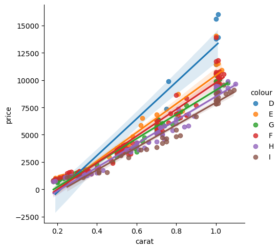
Using aesthetics#
As with all other plots, you can still use aesthetics which will naturally split the data in categories and generate a fit for each of them:
sns.lmplot(data=diams, x='carat', y='price', hue='colour');
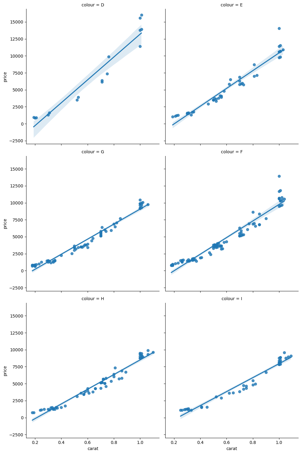
If you want to separate your plots you can also use the col argument. Instead of assigning a color to each subset, seaborn just create one subplot per subset:
sns.lmplot(data=diams, x='carat', y='price', col='colour', col_wrap=2);
Other fits#
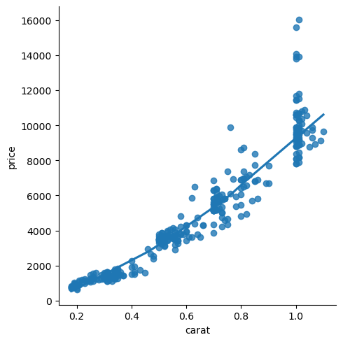
You are not restricted to perform a linear fit. You can also use polynomials. For that you have to specify the order of the polynomial. For example to fit a parabola:
sns.lmplot(data=diams, x='carat', y='price', order=2);
You can also use a lowess model (locally weighted scatterplot smoothing) if your data don’t fit a simpler model:
sns.lmplot(data=diams, x='carat', y='price', lowess=True);
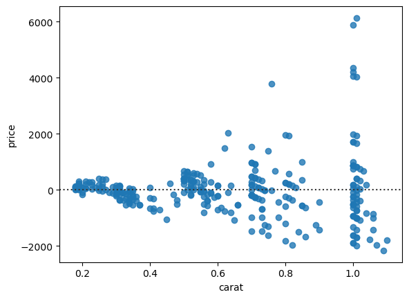
Residuals#
Whenver you do a fit of the data, it’s a good idea to check the residuals, i.e. the difference between actual and predicted data, which ideally should be distributed around 0. Seaborn has a specific function for that called residplot. For our quadratic fit above we would use the same options, only the output is different:
sns.residplot(data=diams, x='carat', y='price', order=2);
Exercise#
Try to fit a linear regression to the bill_depth_mm vs bill_length_mm data. Does the result make sense ? If not, how can you easily fix this?