15. Seaborn: distributions and relations#
As we have just seen, seaborn allows to draw very quickly complex plots in order to explore data. Here we further explore the capabilities offered by the packages to quickly visualize relations and ditributions
import pandas as pd
import numpy as np
import matplotlib.pyplot as plt
import seaborn as sns

diams = pd.read_csv('https://raw.githubusercontent.com/vincentarelbundock/Rdatasets/master/csv/Ecdat/Diamond.csv', index_col=0)
Generalistic functions#
Seaborn has seversl generalistic functions offering a framework to display ditributions or relations. They essentially build on simpler functions like scatterplot or histplot but can be quickly used to switch visualization types.
As we have already seen options for scatter plots, we here we explore catplot which gives access to a long list of other plotting functions such as boxplots, swarmplots etc. all working with the same syntax.
Let’s see what de default settings produce when we want to visualize the price distribution y for each color x:
g = sns.catplot(data=diams, x='colour', y='price');
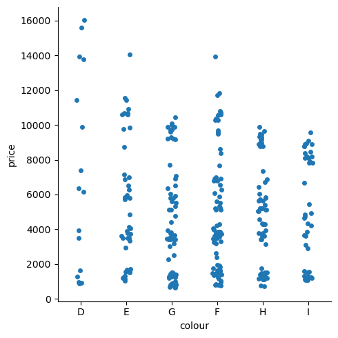
The result is a very reasonable stripplot, a scatter plot with one categorical variable. As you can see some jitter is added to help visualize all points. Note that the output of catplot is a facetgrid object, not a simple axis. We wont explore in details facet grids, but just know that you can still acces the axes and the figure composing this object with:
g
<seaborn.axisgrid.FacetGrid at 0x15abe1690>
g.ax
<Axes: xlabel='colour', ylabel='price'>
g.fig
Customization#
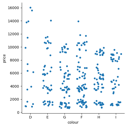
As usual, you have many options to optimize the plot, some of them specific to the current type such as jitter here:
sns.catplot(data=diams, x='colour', y='price', jitter=0.3);
diams.head()
| carat | colour | clarity | certification | price | |
|---|---|---|---|---|---|
| 1 | 0.30 | D | VS2 | GIA | 1302 |
| 2 | 0.30 | E | VS1 | GIA | 1510 |
| 3 | 0.30 | G | VVS1 | GIA | 1510 |
| 4 | 0.30 | G | VS1 | GIA | 1260 |
| 5 | 0.31 | D | VS1 | GIA | 1641 |
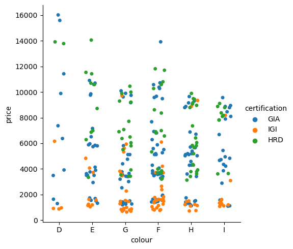
Also, just like in the regular plots, we can use aesthetics. We can for example here use the hue to represent the certification:
sns.catplot(data=diams, x='colour', y='price', hue='certification', jitter=.2);
Picking the type of plot#
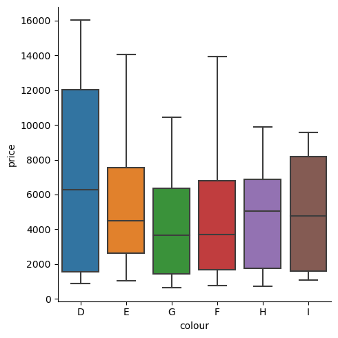
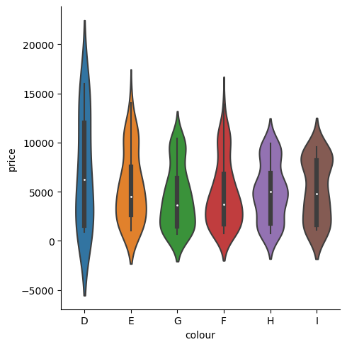
The catplot has one essential parameter, kind, which allows us to select alternative types of plots. For example we can produce box plots or violin plots:
sns.catplot(data=diams, x='colour', y='price', kind='box');
sns.catplot(data=diams, x='colour', y='price', kind='violin');
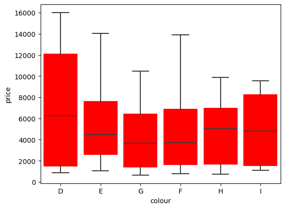
Of course in each case, you could use the corresponing base function directly. For example for the boxplot function. Keep in mind that all these plots rely on Matplotlib, so usually, in addition to seaborn options, you can also use the appropriate Matplotlib options. For example here the boxprops option:
boxprops = dict(linewidth=3, color='red')
sns.boxplot(data=diams, x='colour', y='price', boxprops=boxprops);
Other plots#
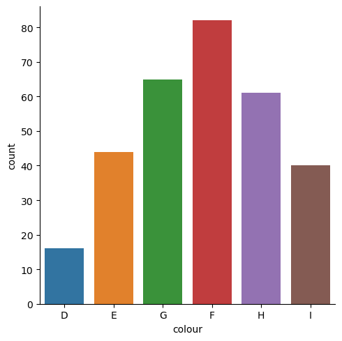
catplot gives access to many more functions as visible here. For example you can easily also easily create a count histogram:
sns.catplot(data=diams, x='colour', kind='count');
Combining plots#
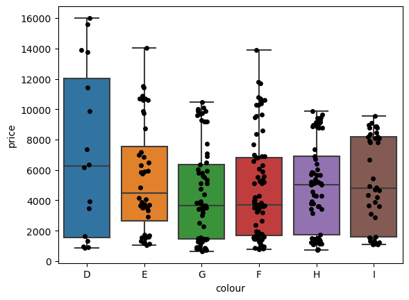
It is often interesing to mix multiple plots. For example here we might want to see box plots and swarmplots overlapping to better visualize the distribution. Here again we first create an axis object that we can repeatedly use afterwards. We also use here the base functions:
fig, ax = plt.subplots()
sns.boxplot(data=diams, x='colour', y='price', ax=ax);
sns.stripplot(data=diams, x='colour', y='price', color='k',ax=ax);
2D distributions#
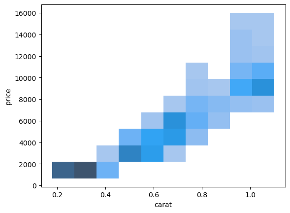
We have seen until know only 1D distributions as histograms and plotted 2D relations as scatterplots. We can however also represent 2D distributions directly, which is particularly helpful if datapoints are very dense. For that we can simply use the histplot function, but with both x and y parameters.
sns.histplot(diams, x="carat", y="price");
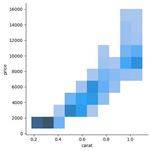
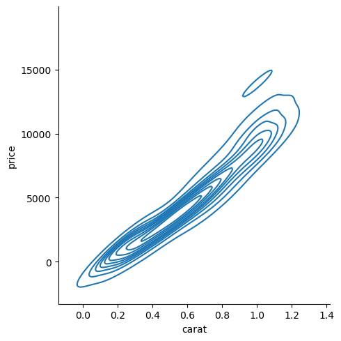
Alternatively we can also use here the more general displot function, which functions in the same way as the catplot in that we can choose the kind of plot we want such as hist or kde:
sns.displot(diams, x="carat", y="price");
sns.displot(diams, x="carat", y="price", kind='kde');
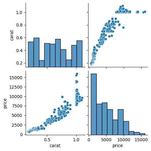
Exploring with pairplots and jointplots#
Seaborn also offers a very efficient way to check relationships between multiple variables of a dataset with the pairplot and jointplot functions.
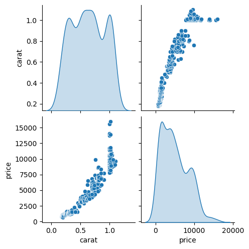
By default pairplot producess a grid with histograms and scatterplots for all pairs of varaibles:
sns.pairplot(diams);
This can be adjuste of course. For example we could use a kde on the diagonal for example:
sns.pairplot(diams, diag_kind='kde');
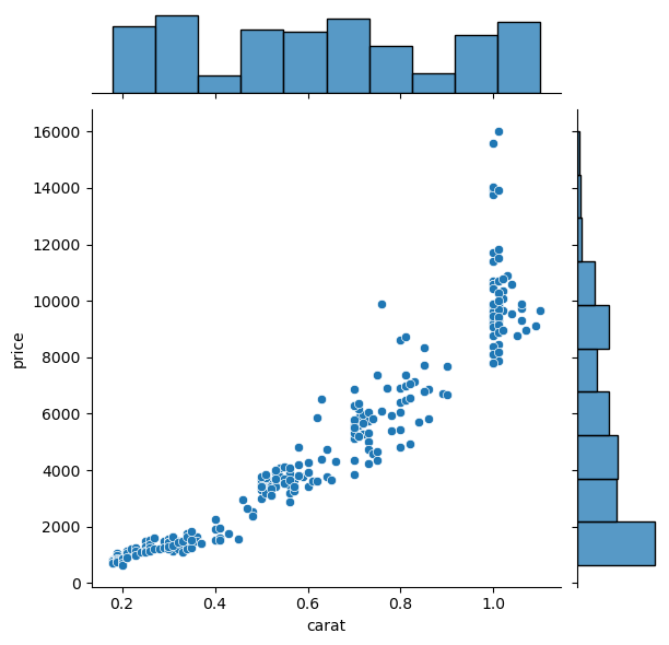
The jointplot functions allows to show at the same time the relation between two variables and their distribution:
sns.jointplot(data=diams, x="carat", y="price");
Exercise#
Knowing that the type of plot below has the kind
swarmfor swarmplot, try to reproduce the figure below.Using
displotshow the 2D distribution of bill length and bill depth as shown in the second plot.

penguins = pd.read_csv('https://raw.githubusercontent.com/allisonhorst/palmerpenguins/master/inst/extdata/penguins.csv')
penguins.head(5)
| species | island | bill_length_mm | bill_depth_mm | flipper_length_mm | body_mass_g | sex | year | |
|---|---|---|---|---|---|---|---|---|
| 0 | Adelie | Torgersen | 39.1 | 18.7 | 181.0 | 3750.0 | male | 2007 |
| 1 | Adelie | Torgersen | 39.5 | 17.4 | 186.0 | 3800.0 | female | 2007 |
| 2 | Adelie | Torgersen | 40.3 | 18.0 | 195.0 | 3250.0 | female | 2007 |
| 3 | Adelie | Torgersen | NaN | NaN | NaN | NaN | NaN | 2007 |
| 4 | Adelie | Torgersen | 36.7 | 19.3 | 193.0 | 3450.0 | female | 2007 |