12. Matplotlib: data content#
Visualization is an essential step for any data analysis. It can both help to design an analysis and to present results. There is a large choice of plotting libraries in Python, all with different strengths and weaknesses. In the frame of this course, we present two of them: Matplotlib and seaborn. We use these two packages because 1) they are very popular and you will necessarily encounter them, 2) they are examples of low- (Matplotlib) and hihgh-level (seaborn) libraries, 3) they represent two different plotting “philosophies” and finally 4) seaborn builds on top of Matplotlib which facilitates the learning.
We start here with Matplotlib which is one of the oldest plotting libraries in Python. Many packages build more user-friendly packages on top of it (like seaborn), making it useful to know as basis. In this chapter and the next, we present only the basics of Matplotlib such as figure creation and basic customization of plot rendering (colors, markers, title etc.) In the next chapters we then we move to seaborn, which we recommend as default plotting library, and also highlight its connection to Matplotlib. Finally we will come back to Matplotlib to show examples of advanced plotting that can be usually be done in an easier way in seaborn but that you might encounter in Matplotlib.
First we load the necessary packages:
import pandas as pd
import numpy as np
import matplotlib.pyplot as plt
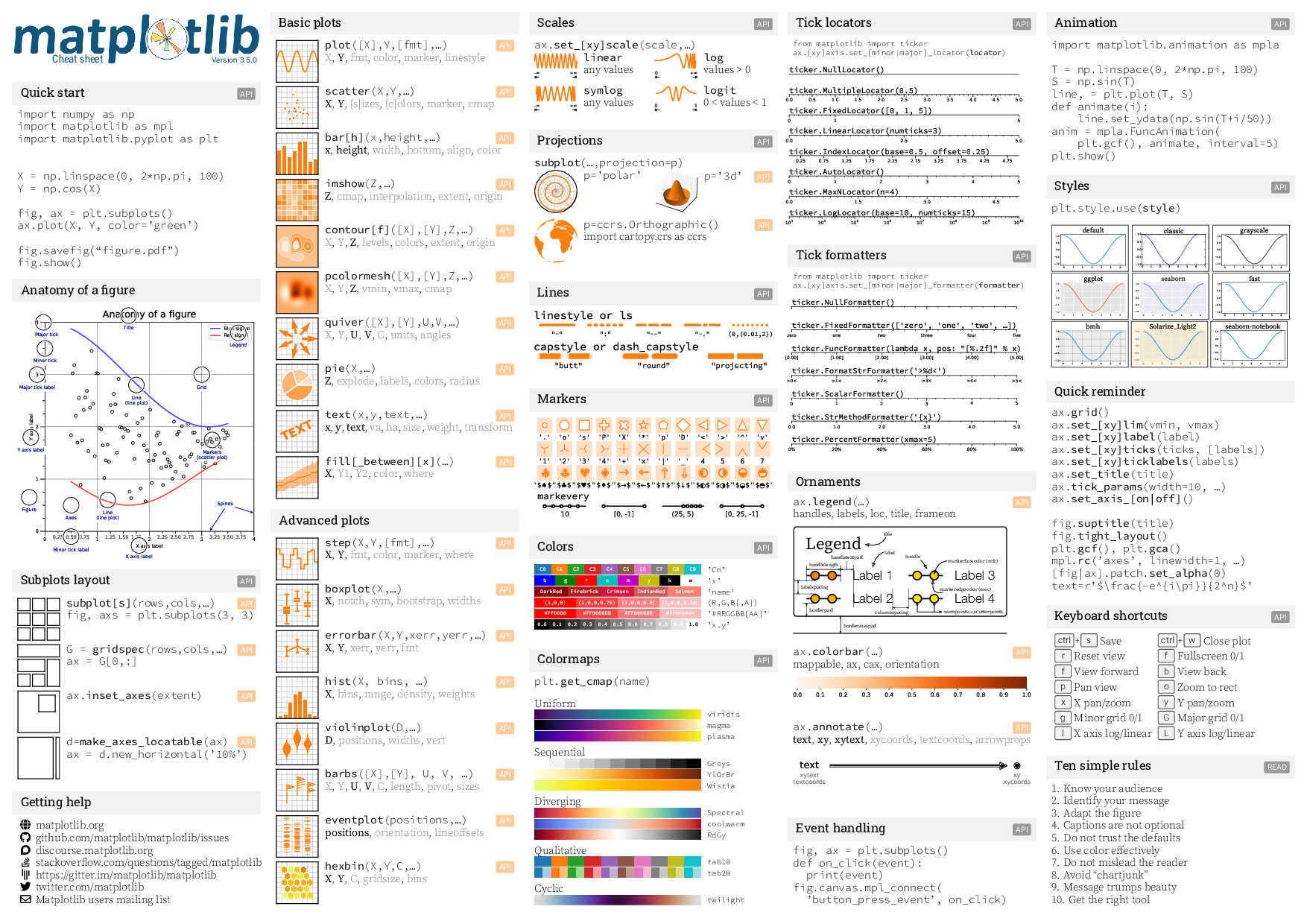
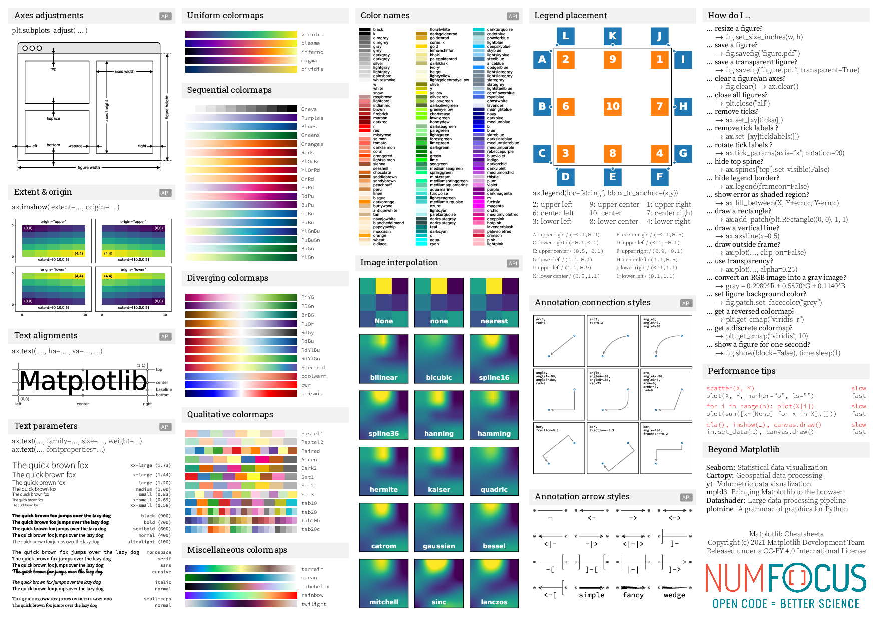
Cheat sheet#
You can find many cheat sheets online. Here’s one that is quite complete.
from IPython.display import Image
Image('https://matplotlib.org/cheatsheets/_images/cheatsheets-1.png')
Image('https://matplotlib.org/cheatsheets/_images/cheatsheets-2.png')
Dataset#
Throughout these notebooks we will use various open datasets, mostly comming from the R world which provides a collection of interesting datasets for teaching purposes.
Our first dataset describes diamonds. The dataset includes both numerical data such as the price and categorical data such as the the color.
diams = pd.read_csv('https://raw.githubusercontent.com/vincentarelbundock/Rdatasets/master/csv/Ecdat/Diamond.csv')
diams.head(5)
| Unnamed: 0 | carat | colour | clarity | certification | price | |
|---|---|---|---|---|---|---|
| 0 | 1 | 0.30 | D | VS2 | GIA | 1302 |
| 1 | 2 | 0.30 | E | VS1 | GIA | 1510 |
| 2 | 3 | 0.30 | G | VVS1 | GIA | 1510 |
| 3 | 4 | 0.30 | G | VS1 | GIA | 1260 |
| 4 | 5 | 0.31 | D | VS1 | GIA | 1641 |
The figure and axis#
We have seen in the “minimal plotting” notebook that the first step of any plotting is to create 1) a figure that will contain all the plot parts and 2) one or more axis objects that will contains specific parts of the figure e.g. if we want to create a grid of plots. There are multiple ways of creating these objects, but here we just use the subplots (don’t forget the final s) function:
fig, ax = plt.subplots()
Size and grid#
We will use only thre parameters of the subplots function: to set its size figsize:
fig, ax = plt.subplots(figsize=(10,3))
and to get a grid of plots with nrows rows and ncols columns instead of a single plot:
fig, ax = plt.subplots(figsize=(10,3), nrows=2, ncols=3)
Note that here the returned ax is not a simple axis object but an array of axis objects:
ax
array([[<Axes: >, <Axes: >, <Axes: >],
       [<Axes: >, <Axes: >, <Axes: >]], dtype=object)
Adding data#
It is very easy to add one or multiple plot to the same ax object by using plotting function like plot attached to the ax object. In case we are dealing with a grid of plots, we have to select the correct position e.g. ax[0,1] for the plot in the first line and second column of a 2d grid. If we deal with a single row of plots, ax[1]] is sufficient:
fig, ax = plt.subplots(nrows=1, ncols=2, figsize=(10,3))
ax[1].plot(diams.carat, diams.price);
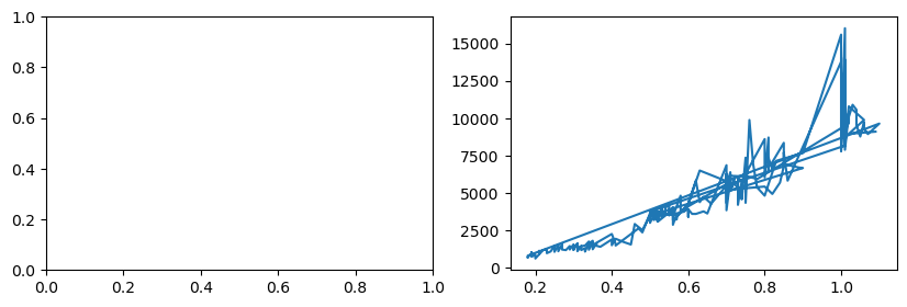
Markers and lines#
As you can see, Matplotlib uses default settings for plotting: no markers, blue line. Of course all these can be overriden. In particular here we need only markers and no line. For this we use the marker and linestyle option. You can find all options in the cheat sheet above or directly in the documentation.
fig, ax = plt.subplots()
ax.plot(diams.carat, diams.price, marker= 'o', linestyle='');
Adding more data#
Let’s imagine that we fitted a curve to our data, here a simple parabola \(f(x) = a*x^2 + b*x + c\):
import scipy.optimize
def parabola(x, a, b, c):
    return a * x**2 + b*x + c

fit_params, _ = scipy.optimize.curve_fit(parabola, diams.carat, diams.price)
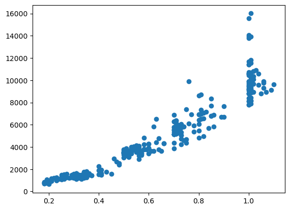
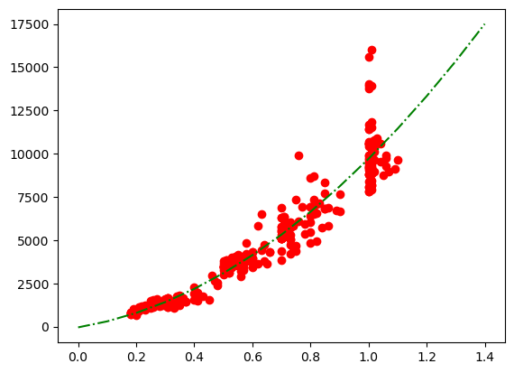
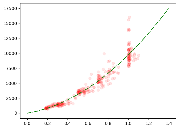
Now we want to superpose this to our data. We use here a dotted line and no marker.
fig, ax = plt.subplots()
ax.plot(diams.carat, diams.price, marker= 'o', color='red', linestyle='')
ax.plot(np.arange(0,1.5,0.1), parabola(np.arange(0,1.5,0.1), *fit_params), linestyle='-.', color='green');
Short format#
The formating can be specified in the shortned string fmt = '[marker][line][color]' which makes this changes much more succint:
fig, ax = plt.subplots()
ax.plot(diams.carat, diams.price, 'or')
ax.plot(np.arange(0,1.5,0.1), parabola(np.arange(0,1.5,0.1), *fit_params), '-.g');
Transparency#
Finally, we see that because of the density of points, we cannot really distinguish points. One way to improve this is to add transparency. This is done in almost all plots via the alpha option:
fig, ax = plt.subplots()
ax.plot(diams.carat, diams.price, 'or', alpha=0.1)
ax.plot(np.arange(0,1.5,0.1), parabola(np.arange(0,1.5,0.1), *fit_params), '-.g');
Automatic settings for multiple plots#
If we don’t specify any setthings and try to plot multiple datasets on the same plot, Matplotlib automatically handles the different settings for us. For example let’s imagine that we want to plot the same dependency but for each color separately. We know how to extract the rows corresponding to a specific color:
diams['colour'].unique()
array(['D', 'E', 'G', 'F', 'H', 'I'], dtype=object)
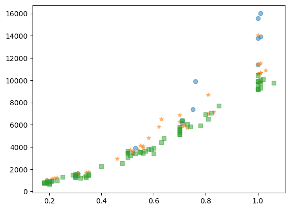
Let’s do it for three colors: D, E and G. We see that since we want to have markers, we have to specify them manually:
fig, ax = plt.subplots()
ax.plot(diams[diams['colour']=='D'].carat, diams[diams['colour']=='D'].price, 'o', alpha=.5);
ax.plot(diams[diams['colour']=='E'].carat, diams[diams['colour']=='E'].price,'*', alpha=.5);
ax.plot(diams[diams['colour']=='G'].carat, diams[diams['colour']=='G'].price,'s', alpha=.5);
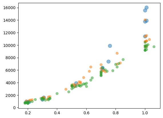
Scatter plot#
Instead of the plot function you can also use the scatter function which is very similar. The main difference is tha sctter by default plots points instead of lines. It also has a few specifiy options like s to set the point size:
fig, ax = plt.subplots()
ax.scatter(diams[diams['colour']=='D'].carat, diams[diams['colour']=='D'].price, alpha=.5, s=80);
ax.scatter(diams[diams['colour']=='E'].carat, diams[diams['colour']=='E'].price, alpha=.5);
ax.scatter(diams[diams['colour']=='G'].carat, diams[diams['colour']=='G'].price, alpha=.5);
Histograms#
As you can see in the cheat sheet, Matplotlib offers many different types of plots. They of course all have their specificities but all share the same principles for dealing with
multiple superposed plots with
axre-usageformating options
axis limits
etc.
Let’s see a few examples. For example we can create a histogram of diamond price as a function of color. We have here two options: we can directly use hist or first create a histogram and plot it with bar:
fig, ax = plt.subplots()
ax.hist(diams[diams['colour'] == 'D']['price'])
ax.hist(diams[diams['colour'] == 'E']['price']);
Here we have multiple things to improve:
We need to use the same bins for both colors. At the moment bins are optimized for each dataset which makes comparison impossible.
We need transparency
We could make the bar’s edge white to distinguish them
You can find all options here. Additionally, you can find all options for styling the bars (which are just squares or Patches) here.
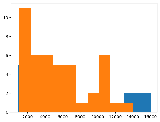
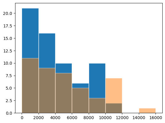
bins = np.arange(0,17000,2000)
fig, ax = plt.subplots()
ax.hist(diams[diams['colour'] == 'G']['price'], bins=bins, edgecolor='white')
ax.hist(diams[diams['colour'] == 'E']['price'], bins=bins,alpha=0.5, edgecolor='white');
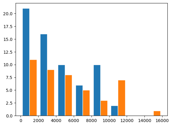
Even more practical, you can create plots with stacked bars, if you directly use multiple datasets:
bins = np.arange(0,17000,2000)
fig, ax = plt.subplots()
ax.hist([diams[diams['colour'] == 'G']['price'], diams[diams['colour'] == 'E']['price']], bins=bins, edgecolor='white');
Exercise#
Import the penguins data: https://raw.githubusercontent.com/allisonhorst/palmerpenguins/master/inst/extdata/penguins.csv
Try to reproduce the following plot: on the lect scatter plot of the
body_mass_gas a function ofbill_depth_mmand on the right histogram of thebody_mass_g.

Try to reproduce the second graph where each species is represented separately. Remember that you can get all species with
unique_species = penguins['species'].unique()and can then use a for loop over that list.
