13. Matplotlib: adjusting non-data elements#
We will see later on other types of plots that we can generate, but before that, we want to explore how we can adjust the myriad of elements of a plot: titles, axis, ticks etc.
import pandas as pd
import numpy as np
import matplotlib.pyplot as plt
import scipy.optimize
diams = pd.read_csv('https://raw.githubusercontent.com/vincentarelbundock/Rdatasets/master/csv/Ecdat/Diamond.csv')

def parabola(x, a, b, c):
    return a * x**2 + b*x + c
fit_params, _ = scipy.optimize.curve_fit(parabola, diams.carat, diams.price)
Modify the axis#
The axis properties can be modified via methods attached to the ax object. For example we can set limits:
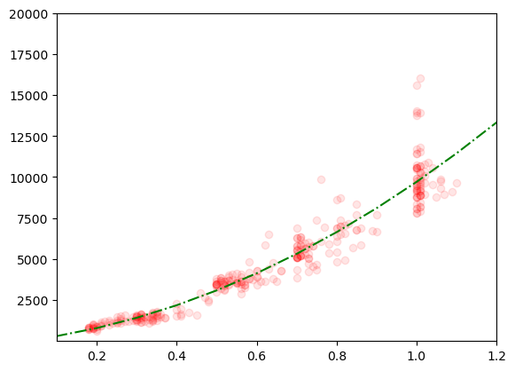
fig, ax = plt.subplots()
ax.plot(diams.carat, diams.price, 'ro', alpha=0.1);
ax.plot(np.arange(0,1.5,0.1), parabola(np.arange(0,1.5,0.1), *fit_params), linestyle='-.', color='green');
ax.set_xlim(left=0.1, right=1.2)
ax.set_ylim(bottom=1, top=20000);
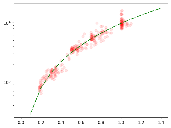
We can also change the axis type itself. For example we can turn our plot into a log plot by changing the type of the y-axis:
fig, ax = plt.subplots()
ax.plot(diams.carat, diams.price, 'ro', alpha=0.1);
ax.plot(np.arange(0,1.5,0.1), parabola(np.arange(0,1.5,0.1), *fit_params), linestyle='-.', color='green');
ax.set_yscale('log');
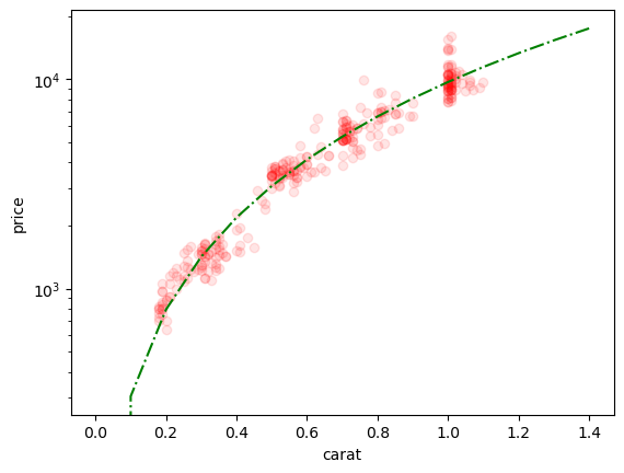
Adding labels#
One should always use labels for all axis. We can do this with the set_xlabel and set_ylabel methods:
ax.set_xlabel('carat')
ax.set_ylabel('price')
fig
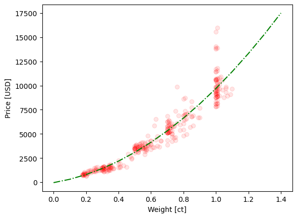
Avoid hard-coding#
Ideally you should try to hard-code too much information throughout your code. For example, you might produce several plots with the same data, and if you decide to change the labelling you want to avoid having to manually update the label in each single plot. Here’s a possible solution: you could create a dictionary that maps a column name to a label. Whenever you want to use a specific column you then just call that dictionary for labelling!
label_dict = {'carat': 'Weight [ct]', 'price': 'Price [USD]'}
Now when we want to create a plot, we can set everything at the beginning:
x_axis = 'carat'
y_axis = 'price'
fig, ax = plt.subplots()
ax.plot(diams[x_axis], diams[y_axis], 'ro', alpha=0.1);
ax.plot(np.arange(0,1.5,0.1), parabola(np.arange(0,1.5,0.1), *fit_params), linestyle='-.', color='green');
ax.set_xlabel(label_dict[x_axis])
ax.set_ylabel(label_dict[y_axis]);
More advanced labels#
Sometimes you want to use variables in your label, so that the label adjusts exactly to your current settting. For example, let’s imagine that you want to scale your y axis by some factor. You’d like this to be represented in your label. There are different solutions to achieve this but the most “modern” one is to use f-strings
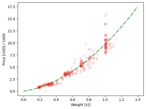
factor = 1000
fig, ax = plt.subplots()
ax.plot(diams[x_axis], diams[y_axis]/factor, 'ro', alpha=0.1);
ax.plot(np.arange(0,1.5,0.1), parabola(np.arange(0,1.5,0.1), *fit_params)/factor, linestyle='-.', color='green');
ax.set_xlabel(label_dict[x_axis])
ax.set_ylabel(f'{label_dict[y_axis]} / {factor}');
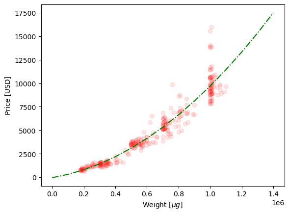
Finally if you are familiar with \(\LaTeX\), you can also use it in labels, as well as for any other text. For example let’s imagine we dealy with micrograms in the x axis, we could use:
w_factor = 10**6
fig, ax = plt.subplots()
ax.plot(diams[x_axis]*w_factor, diams[y_axis], 'ro', alpha=0.1);
ax.plot(np.arange(0,1.5,0.1)*w_factor, parabola(np.arange(0,1.5,0.1), *fit_params), linestyle='-.', color='green');
ax.set_xlabel('Weight [$\mu g$]')
ax.set_ylabel(label_dict[y_axis]);
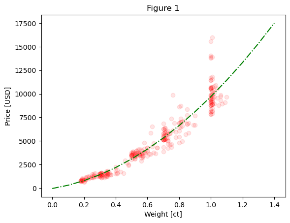
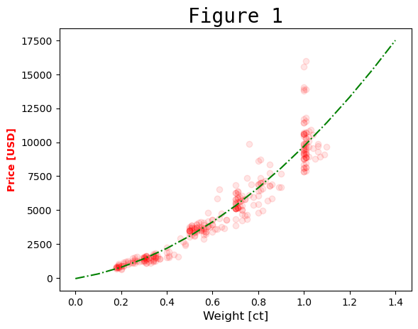
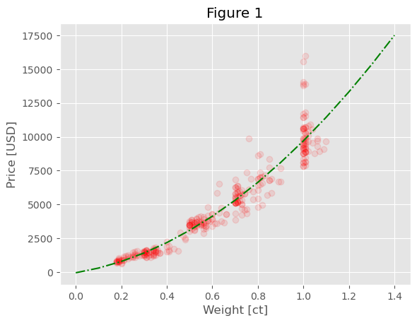
Adding a title#
You can easily add a title to your plot using the set_title() function. It has the same properties as the labels, so you can use f-strings, \(\LaTeX\) etc. As a general rule, beware of not repeating in the title what is alredy shown in the axis labels:
fig, ax = plt.subplots()
ax.plot(diams[x_axis], diams[y_axis], 'ro', alpha=0.1);
ax.plot(np.arange(0,1.5,0.1), parabola(np.arange(0,1.5,0.1), *fit_params), linestyle='-.', color='green');
ax.set_xlabel(label_dict[x_axis])
ax.set_ylabel(label_dict[y_axis]);
ax.set_title('Figure 1');
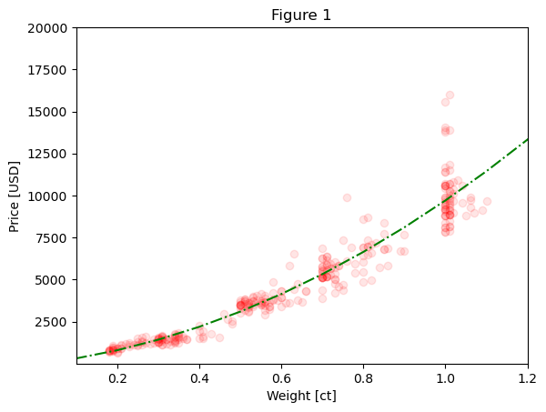
One function to set them all#
Instead of calling all the different function - set_xlabel, set_title etc. you can also use the set_ax function and pass your text as parameters:
fig, ax = plt.subplots()
ax.plot(diams[x_axis], diams[y_axis], 'ro', alpha=0.1);
ax.plot(np.arange(0,1.5,0.1), parabola(np.arange(0,1.5,0.1), *fit_params), linestyle='-.', color='green');
ax.set(xlim=(0.1, 1.2), ylim=(1, 20000), xlabel=label_dict[x_axis], ylabel=label_dict[y_axis], title='Figure 1');
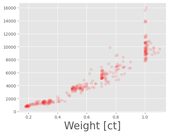
Adjusting the text itself#
There are multiple ways to adjust the text in a figure. The first solution is to adjust the parameters for element in the plot using a list of possible options such as size or weight:
fig, ax = plt.subplots()
ax.plot(diams[x_axis], diams[y_axis], 'ro', alpha=0.1);
ax.plot(np.arange(0,1.5,0.1), parabola(np.arange(0,1.5,0.1), *fit_params), linestyle='-.', color='green');
ax.set_xlabel(label_dict[x_axis], size=12)
ax.set_ylabel(label_dict[y_axis], weight=1000, color='red');
ax.set_title('Figure 1', family='monospace', size=20);
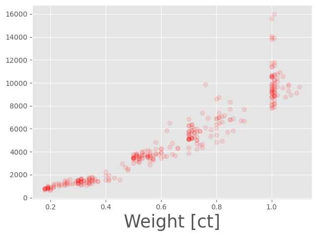
Changing tick marks#
The last element that we have not updated yet are the tick marks. First, let’s reset the defaults (we’ll come back to this later):
plt.style.use('default')
The main way to update tick marks is to use the tick_params function. There you have a series of options (with expected names such as color, labelsize etc) to set everything. For example:
fig, ax = plt.subplots()
ax.plot(diams[x_axis], diams[y_axis], 'ro', alpha=0.1);
ax.tick_params(colors='red',labelsize=15, top=True, labelright=True)
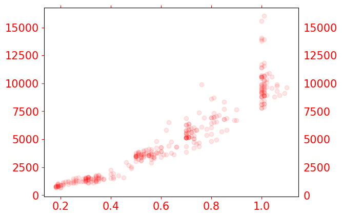
As you can see our options were applied to all tickmarks. We can howeve specify which axis we want to affect usng the axis option:
fig, ax = plt.subplots()
ax.plot(diams[x_axis], diams[y_axis], 'ro', alpha=0.1);
ax.tick_params(axis='x', colors='red',labelsize=15, top=True, labelright=True)
ax.tick_params(axis='y', colors='green',labelsize=15)
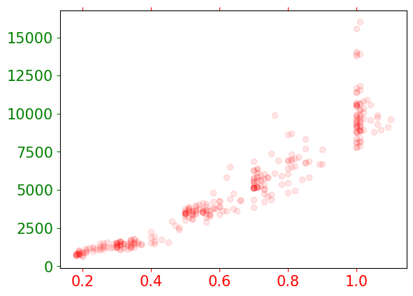
Obviously, as we specified that we wanted to affect the x axis, the labelright option is not taken into account.
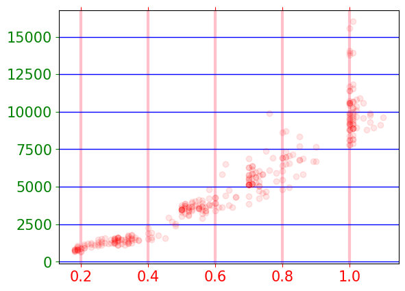
Grid lines#
Finally we can also add grid lines to our plot. This is achieved via the grid function:
fig, ax = plt.subplots()
ax.plot(diams[x_axis], diams[y_axis], 'ro', alpha=0.1);
ax.tick_params(axis='x', colors='red',labelsize=15, top=True, labelright=True)
ax.tick_params(axis='y', colors='green',labelsize=15)
ax.grid(which='major', axis='x', linewidth=3, color='pink')
ax.grid(which='major', axis='y', linewidth=1, color='blue')
General templates#
Instead of specifying everything manually, you can also use pre-made style templates. You can find a complete list here. Then you can use this command with the appropriate style name:
plt.style.use('ggplot')
fig, ax = plt.subplots()
ax.plot(diams[x_axis], diams[y_axis], 'ro', alpha=0.1);
ax.plot(np.arange(0,1.5,0.1), parabola(np.arange(0,1.5,0.1), *fit_params), linestyle='-.', color='green');
ax.set_xlabel(label_dict[x_axis])
ax.set_ylabel(label_dict[y_axis]);
ax.set_title('Figure 1');
Saving the figure#
You can easily save your figure in common formats like PNG and JPG wit the savefig function attached to the fig object. As usual, there are many options to use. One of the most important ones being the resolution dpi:
fig, ax = plt.subplots()
ax.plot(diams[x_axis], diams[y_axis], 'ro', alpha=0.1);
ax.set_xlabel(label_dict[x_axis], size=25)

fig.savefig('myfigure.png', dpi=50)
Note that in some cases, depending on the size of your labels, Matplotlib might cut-off some of the elements on the edges (as happens above). To make sure that this doesn’t happen and that you have minimal white space around your figure, you can use the very useful tight_layout:
fig, ax = plt.subplots()
ax.plot(diams[x_axis], diams[y_axis], 'ro', alpha=0.1);
ax.set_xlabel(label_dict[x_axis], size=25)
plt.tight_layout()
fig.savefig('myfigure2.png', dpi=50)
Exercise#
Load the penguins data https://raw.githubusercontent.com/allisonhorst/palmerpenguins/master/inst/extdata/penguins.csv
Using one of the scatter plots of
body_mass_gas a function ofbill_depth_mm(separated by specied or not), truy to customize the plot to match the example below.Choose a style and apply it to your plot.
